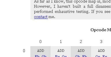
If you look at the 8086 opcode map I put together a few weeks ago, you’ll notice that the left margins of the introductory text area and the “bodies” of the opcode tables are aligned. I like this effect.

Unfortunately, it’s a nightmare to get working perfectly, and the sort of thing I’d advise you to avoid doing in your own CSS layouts.
CSS
The relavent bits of the CSS code (which you can see in its entirety here) are as follows:
div.menu {
    text-align:		left;
    position:		absolute;
    top:		3em;
    left:		3em;
    width:		11em;
}
div.copy {
    background:		#eee;
    text-align:		justify;
    width:		56em;
    margin:		0em auto 0em 11em;
}
table {
    margin:		2em auto 2em 0em;
    border-collapse:	collapse;
}
td.cell {
    vertical-align:	top;
    text-align:		center;
    width:		7em;
    height:		7em;
    padding:		0.5em 0em 0em;
}
td.row_header {
    vertical-align:	top;
    text-align:		right;
    width:		11em;
    padding:		0.5em 0px 0px;
}
The Idea
This CSS was designed to work along these lines:
- The copy text was assigned an 11em left margin
- A small menu was placed into the copy text’s margin
- Each table row was begun with an 11em “header” cell
- Both the copy text and non-header table cells were assigned colored backgrounds
In theory, the colored left edges of the table “bodies” and introductory text should line up, with the row headers flying off to the left in whitespace. In practice, this was impossible (for me, anyway) to get pixel-perfect across all browsers; certain IEs, in particular, gave me a great deal of trouble.
The Problem
I must admit to not knowing, precisely, why this CSS scheme didn’t work on some browsers. The short version appears to be that some browsers don’t apply CSS directives consistently to all HTML elements, resulting in subtle misalignments.
In this case, the “11em”s of the copy’s left-margin don’t appear to be equal to the “11em”s of the row header’s width. Or, perhaps some browsers like to apply a few extra pixels of padding to tables. In any event, it should work, but it doesn’t, and unfortunately a few pixels of misalignment ruins the point of the effect.
I should add that this scheme was the end result of a good deal of fiddling; a number of earlier approaches worked even less well.
The Solution
The general solution is not to indulge in goofy alignment schemes like this. If you want two elements to line up on the page, put them within a common containing block, and force them to the edges of the containing block’s content area. This is a simple enough scheme that it’s difficult for a browser to muck it up, and any idiosyncracies should at least be consistently applied to all elements.
Alternatives
If I had it to do over, I would break down and use tables for layout; specifically, I would lay out the introductory text and left-hand menu in two cells of a one-row table, and I would use the same classes for the cells of this one-row table that I used when laying out the rows of the opcode tables. This would pretty much guarantee that browsers would render the margins with proper relative alignment.
Such table-based layout is deprecated, of course, but excessively fiddly CSS formatting just doesn’t work, and I’d grown quite fond (perhaps too fond) of my flying row labels.

