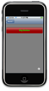
Editorial Note: I was planning to discuss the gloss gradient code in detail today, with an eye to showing how some of its more arbitrary elements could be adjusted to alter the appearance of the gradients that it produces. Unfortunately, that post is running a day late, so instead I’m going to talk about a different way to hack up shiny buttons.
There is a way to create shiny buttons built in to the iPhone API, aside from the unsupported UIGlassButton class. The segmented control class (UISegmentedControl) will render widgets of the UISegmentedControlStyleBar control style with a “glossy” appearance. There are certain drawbacks, of course.
General Approach
Here’s how you’d typically use a segmented control:
// Implement loadView to create a view hierarchy programmatically, without using a nib.
- (void)loadView
{
	// TL view
	self.view = [[UIView alloc] initWithFrame:CGRectZero];
	self.view.backgroundColor = [UIColor whiteColor];

	UISegmentedControl* sc = [[[UISegmentedControl alloc] initWithFrame:CGRectMake(110, 12, 100, 24)] autorelease];
	[sc insertSegmentWithTitle:@"Foo" atIndex:0 animated:NO];
	[sc insertSegmentWithTitle:@"Bar" atIndex:1 animated:NO];
	[sc insertSegmentWithTitle:@"Baz" atIndex:2 animated:NO];
	sc.tintColor = [UIColor colorWithRed:0.7 green:0.0 blue:0.0 alpha:1];
	sc.segmentedControlStyle = UISegmentedControlStyleBar;
	[self.view addSubview:sc];
}
If you wanted to use this class to create a single large buttons, the code would look like this:
- (void)loadView
{
	// TL view
	self.view = [[UIView alloc] initWithFrame:CGRectZero];
	self.view.backgroundColor = [UIColor whiteColor];

	UISegmentedControl* sc = [[[UISegmentedControl alloc] initWithFrame:CGRectMake(5, 27, 310, 54)] autorelease];
	[sc insertSegmentWithTitle:@"Big Button" atIndex:0 animated:NO];
	sc.tintColor = [UIColor colorWithRed:0.7 green:0.0 blue:0.0 alpha:1];
	sc.segmentedControlStyle = UISegmentedControlStyleBar;
	[self.view addSubview:sc];
}
Unfortunately, there are a few problems:
- You can’t control the font or size of the button text.
- This button doesn’t act like a “normal” button in terms of highlighting, etc.
- Bar buttons look sort of iffy blown up to this scale, and standing alone.
These problems can all be addressed, to greater or lesser degrees.
Text
The problem of text appearance can be solved pretty comprehensively, albeit at the cost of some effort. Briefly, the solution is to render text into an image, and then paste that image onto the button. The code to do so might look like this:
- (void)loadView
{
	// TL view
	self.view = [[UIView alloc] initWithFrame:CGRectZero];
	self.view.backgroundColor = [UIColor whiteColor];


	// Text bounds
	NSString*	text	= @"Big Button";
	UIFont*		font	= [UIFont boldSystemFontOfSize:18];
	CGSize		size	= [text sizeWithFont:font];

	// Rendering context
	UIGraphicsBeginImageContext(size);
	CGContextRef context = UIGraphicsGetCurrentContext();

	// Set colors
	CGContextSetFillColorWithColor(context, [[UIColor greenColor] CGColor]);
	CGContextSetStrokeColorWithColor(context, [[UIColor greenColor] CGColor]);

	// Render
	[text drawInRect:CGRectMake(0, 0, size.width, size.height) withFont:font];

	// Create image and release context
	UIImage* image = UIGraphicsGetImageFromCurrentImageContext();
	UIGraphicsEndImageContext();

	// Segmented control
	UISegmentedControl* sc = [[[UISegmentedControl alloc] initWithFrame:CGRectMake(5, 27, 310, 54)] autorelease];
	[sc insertSegmentWithImage:image atIndex:0 animated:NO];
	sc.tintColor = [UIColor colorWithRed:0.7 green:0.0 blue:0.0 alpha:1];
	sc.segmentedControlStyle = UISegmentedControlStyleBar;
	[self.view addSubview:sc];
}
Behaviour
The quickest way to make a UISegmentedControl act sort of like a normal button is to set its momentary property to YES. If you subclassed it, you might be able to do better, but I’m only interested in presenting a quick hack here.
Appearance
Since we’re getting a “glossy” appearance by using an image that’s supposed to be inset into a bar (the segmentedControlStyle is UISegmentedControlStyleBar, after all) the image doesn’t really look right when standing free. As a quick fix, I find that a gray background looks better. Code that incorporates this fix, plus the behaviour fix discussed above, would look like this:
- (void)loadView
{
	// TL view
	self.view = [[UIView alloc] initWithFrame:CGRectZero];
	self.view.backgroundColor = [UIColor grayColor];


	// Text bounds
	NSString*	text	= @"Big Button";
	UIFont*		font	= [UIFont boldSystemFontOfSize:18];
	CGSize		size	= [text sizeWithFont:font];

	// Rendering context
	UIGraphicsBeginImageContext(size);
	CGContextRef context = UIGraphicsGetCurrentContext();

	// Set colors
	CGContextSetFillColorWithColor(context, [[UIColor greenColor] CGColor]);
	CGContextSetStrokeColorWithColor(context, [[UIColor greenColor] CGColor]);

	// Render
	[text drawInRect:CGRectMake(0, 0, size.width, size.height) withFont:font];

	// Create image and release context
	UIImage* image = UIGraphicsGetImageFromCurrentImageContext();
	UIGraphicsEndImageContext();

	// Segmented control
	UISegmentedControl* sc = [[[UISegmentedControl alloc] initWithFrame:CGRectMake(5, 27, 310, 54)] autorelease];
	[sc insertSegmentWithImage:image atIndex:0 animated:NO];
	sc.tintColor = [UIColor colorWithRed:0.7 green:0.0 blue:0.0 alpha:1];
	sc.segmentedControlStyle = UISegmentedControlStyleBar;
	sc.momentary = YES;
	[self.view addSubview:sc];
}
It is a hack, but perhaps you will find it useful. It’s a lot simpler to get working that the roll-your-own glossy buttons we’ve been building, and it’s not quasi-legal like
 UIGlassButton.

