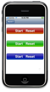
 Today, we package the gloss gradient and rounded rect code we developed on Monday and Friday into a
 UIButton category, and take a quick look at adding labels to these buttons; the latter discussion is much simpler than I had anticipated.
Code
Without further ado, here are the header and implementation files for the Glossy category of UIButton. In addition to the code we’ve seen previously, I added the following top-level supervisor/convenience function:
- (void)setBackgroundToGlossyRectOfColor:(UIColor*)color withBorder:(BOOL)border forState:(UIControlState)state
{
	static const float MIN_SIZE = 4;

	// Get and check size
	CGSize size = self.frame.size;
	if ((size.width < MIN_SIZE) || (size.height < MIN_SIZE)) return;

	// Create and get a pointer to context
	UIGraphicsBeginImageContext(size);
	CGContextRef context = UIGraphicsGetCurrentContext();

	// Convert co-ordinate system to Cocoa's (origin in UL, not LL)
	CGContextTranslateCTM(context, 0, size.height);
	CGContextConcatCTM(context, CGAffineTransformMakeScale(1, -1));

	// Set stroke color
	CGContextSetStrokeColorWithColor(context, [[UIColor colorWithRed:159.0/255 green:159.0/255 blue:159.0/255 alpha:1] CGColor]);

	// Draw background image
	if (border)
	{
		// Draw border
		[UIButton setPathToRoundedRect:CGRectMake(0.5, 0.5, size.width-1, size.height-1) forInset:0 inContext:context];
		CGContextStrokePath(context);

		// Prepare clipping region
		[UIButton setPathToRoundedRect:CGRectMake(1, 1, size.width-2, size.height-2) forInset:1 inContext:context];
		CGContextClip(context);

		// Draw glossy image
		[UIButton drawGlossyRect:CGRectMake(1, 1, size.width-2, size.height-2) withColor:color inContext:context];
	}
	else
	{
		// Prepare clipping region
		[UIButton setPathToRoundedRect:CGRectMake(0, 0, size.width, size.height) forInset:0 inContext:context];
		CGContextClip(context);

		// Draw glossy image
		[UIButton drawGlossyRect:CGRectMake(0, 0, size.width, size.height) withColor:color inContext:context];
	}

	// Create and assign image
	[self setBackgroundImage:UIGraphicsGetImageFromCurrentImageContext() forState:state];

	// Release image context
	UIGraphicsEndImageContext();
}
Notes
I suppose a few general remarks are in order:
setBackgroundToGlossyRectOfColor:withBorder:forState:creates and sets a background image for a button appropriate for the button’s current size. This implies two things: First, that the button must have a current size (specifically, both its width and height must be greater than or equal to 4) and second, that things probably won’t work right if the button is subsequently resized. I feel awful about that, but that’s what you get when you take free code from the Internet.- The
borderargument will cause a simple, 1-pixel rounded rect to be drawn around the perimeter of the button. - Two methods (the
setPathToRoundedRect:forInset:inContext:anddrawGlossyRect:withColor:inContext:functions) are still exposed as class methods ofUIButton; I believe they have sufficient general utility to merit this. - In choosing how to present this functionality, I tried to strike a balance between convenience, generality, and symmetry. Since I couldn’t subclass
UIButton, I chose not to hide the fact that the glossy effect is accomplished with a simple background image. This approach is only slightly wordier than a hypotheticalsetTintapproach, allows the caller to manipulate the generated image, and avoids any ugliness with some of the more exoticUIButtonTypes.
Test Code
Here is some case code; it’s designed to be added to a View Controller (in my case, a View Controller that was pushed onto a Navigation Controller’s stack, but probably any VC will do).
- (UIButton*)shinyButtonWithWidth:(NSUInteger)width height:(NSUInteger)height color:(UIColor*)color
{
	// Create button (in UL corner of client area)
	UIButton* button = [UIButton buttonWithType:UIButtonTypeRoundedRect];
	button.frame = CGRectMake(0, 0, width, height);

	// Configure background image(s)
	[button setBackgroundToGlossyRectOfColor:color withBorder:YES forState:UIControlStateNormal];
	[button setBackgroundToGlossyRectOfColor:[UIColor grayColor] withBorder:YES forState:UIControlStateHighlighted];

	// Configure title(s)
	[button setTitle:@"Start   Reset" forState:UIControlStateNormal];
	[button setTitleColor:[UIColor whiteColor] forState:UIControlStateNormal];
	[button setTitleShadowColor:[UIColor colorWithRed:.25 green:.25 blue:.25 alpha:1] forState:UIControlStateNormal];
	[button setTitleShadowOffset:CGSizeMake(0, -1)];
	[button setFont:[UIFont boldSystemFontOfSize:28]];

	// Add to TL view, and return
	[self.view addSubview:button];
	return button;
}

// Implement loadView to create a view hierarchy programmatically, without using a nib.
- (void)loadView
{
	// TL view
	self.view = [[UIView alloc] initWithFrame:CGRectZero];
	self.view.backgroundColor = [UIColor whiteColor];

	// Create buttons
	[self shinyButtonWithWidth:310 height:54 color:[UIColor colorWithRed:.65 green:.05 blue:.05 alpha:1]].center = CGPointMake(160, 54);
	[self shinyButtonWithWidth:310 height:54 color:[UIColor colorWithRed:.05 green:.65 blue:.05 alpha:1]].center = CGPointMake(160, 162);
	[self shinyButtonWithWidth:310 height:54 color:[UIColor colorWithRed:.05 green:.05 blue:.65 alpha:1]].center = CGPointMake(160, 270);
}
Note that this code creates UIButtonTypeRoundedRects; it could just as well have created UIButtonTypeCustom, and it would have made no difference.
Text
When I started this project, I had some goofy ideas about rendering text directly onto the glossy images. (My idea was to use the button’s background for the border, and the foreground image for a composited glossy image and label.) This idea is a non-starter because:
- Rendering text onto the glossy images would make them completely non-stretchable. (Not that I’m stretching them now, but I’ve got plans.)
- It’s far more complex that using
UIButton'sbuilt-in title and (foreground) image support.
So, this part of the project just went *poof*, which is nice from the standpoint of elegance, but a little awkward from the standpoint of blogging. Ah well.

