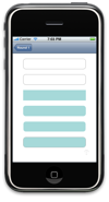
 As promised, here are some test cases that exercise the rounded rect code presented yesterday. (If you want to study the results, click on the image to the left for a full-size screenshot.) Although only intended for testing, this code might also be useful for some simple homemade buttons.
Code
Here is the test case code; it’s designed to be added to a View Controller (in my case, a View Controller that was pushed onto a Navigation Controller’s stack, but probably any VC will do). This code renders 6 images:
- A system RoundedRect button (240×40 pixels)
- A rounded rect drawn with our path generation code (240×40 pixels)
- An unclipped 240×40 pixel rectangle
- A 240×40 pixel rectangle clipped to a 240×40 pixel rounded rect
- A 238×38 pixel rectangle clipped to a 238×38 pixel rounded rect
- The preceeding image inset in a 240×40 pixel system RoundedRect button
This code assumes that yesterday’s code has been added to a Glossy category of UIButton.
- (UIButton*)buttonWithWidth:(NSUInteger)width height:(NSUInteger)height
{
	// Create button (in UL corner of client area)
	UIButton* button = [UIButton buttonWithType:UIButtonTypeRoundedRect];
	button.frame = CGRectMake(0, 0, width, height);

	// Add to TL view, and return
	[self.view addSubview:button];
	return button;
}
- (CGContextRef)currentImageContextWithWidth:(NSUInteger)width height:(NSUInteger)height
{
	// Create and get a pointer to context
	UIGraphicsBeginImageContext(CGSizeMake(width, height));
	CGContextRef context = UIGraphicsGetCurrentContext();

	// Convert co-ordinate system to Cocoa's (origin in UL, not LL)
	CGContextTranslateCTM(context, 0, height);
	CGContextConcatCTM(context, CGAffineTransformMakeScale(1, -1));

	// Set fill and stroke colors
	CGContextSetFillColorWithColor(context, [[UIColor colorWithRed:0.65 green:0.85 blue:0.85 alpha:1] CGColor]);
	CGContextSetStrokeColorWithColor(context, [[UIColor colorWithRed:159.0/255 green:159.0/255 blue:159.0/255 alpha:1] CGColor]);

	// Return context
	return context;
}
- (UIImage*)imageFromCurrentContext
{
	UIImage* image = UIGraphicsGetImageFromCurrentImageContext();
	UIGraphicsEndImageContext();
	return image;
}
- (UIImageView*)imageViewFromCurrentContext
{
	UIImageView* imageView = [[[UIImageView alloc] initWithImage:[self imageFromCurrentContext]] autorelease];
	[self.view addSubview:imageView];
	return imageView;
}

// Implement loadView to create a view hierarchy programmatically, without using a nib.
- (void)loadView
{
	UIButton*	button;
	CGContextRef	context;
	UIImage*	image;
	UIImageView*	imageView;


	// TL view
	self.view = [[UIView alloc] initWithFrame:CGRectZero];
	self.view.backgroundColor = [UIColor whiteColor];


	// Create a basic rounded rect button
	[self buttonWithWidth:240 height:40].center = CGPointMake(160, 40);


	// Create drawing context for a rounded rectangle's border
	context = [self currentImageContextWithWidth:240 height:40];
	// Add stroking path
	// * Runs through pixel centers
	// * Dimensions reduced by 1 to allow for 1-pixel stroke width
	[UIButton setPathToRoundedRect:CGRectMake(0.5, 0.5, 240-1, 40-1) forInset:0 inContext:context];
	// Stroke path
	CGContextStrokePath(context);
	// Create and position image
	[self imageViewFromCurrentContext].center = CGPointMake(160, 100);


	// Create drawing context for a rectangular image
	context = [self currentImageContextWithWidth:240 height:40];
	// Fill image
	CGContextFillRect(context, CGRectMake(0, 0, 240, 40));
	// Create and position image
	[self imageViewFromCurrentContext].center = CGPointMake(160, 160);


	// Create drawing context for a rounded image
	context = [self currentImageContextWithWidth:240 height:40];
	// Add clipping path
	// * Runs around the perimeter of the included area
	// * Dimensions are *not* reduced, as path is a zero-thickness boundary
	[UIButton setPathToRoundedRect:CGRectMake(0, 0, 240, 40) forInset:0 inContext:context];
	CGContextClip(context);
	// Fill image
	CGContextFillRect(context, CGRectMake(0, 0, 240, 40));
	// Create and position image
	[self imageViewFromCurrentContext].center = CGPointMake(160, 220);


	// Create drawing context for an inset rounded image
	// Dimensions are reduced by 2, to allow for a 1-pixel surrounding border
	context = [self currentImageContextWithWidth:240-2 height:40-2];
	// Add clipping path
	// * Runs around the perimeter of the included area
	// * Dimensions are *not* (further) reduced, as path is a zero-thickness boundary
	// * A path is created "forInset" 1:
	//   . When one rounded corner is placed inside another, the interior
	//     corner must have its radius reduced for a proper appearance
	[UIButton setPathToRoundedRect:CGRectMake(0, 0, 240-2, 40-2) forInset:1 inContext:context];
	CGContextClip(context);
	// Fill image
	CGContextFillRect(context, CGRectMake(0, 0, 240-2, 40-2));
	// Get image
	image = [self imageFromCurrentContext];


	// Draw the inset image, both alone, and inside a rounded rect button's border
	imageView = [[[UIImageView alloc] initWithImage:image] autorelease];
	[self.view addSubview:imageView];
	imageView.center = CGPointMake(160, 280);

	button = [self buttonWithWidth:240 height:40];
	[button setImage:image forState:UIControlStateNormal];
	button.center = CGPointMake(160, 340);
}
Notes
The test code is supposed to be pretty self-explanatory, but there are one or two things that aren’t as clear as I’d like:
- The first four functions are only there for convenience; the test code was pretty repetitive, so I defined these functions to condense it.
- The
CGContext*CTMstuff incurrentImageContextWithWidth:height:is there to translate between Quartz 2D’s co-ordinate system (origin in the lower left) and Cocoa’s (origin in the upper left). It’s effect is to cancel out the vertical image flip performed byUIGraphicsGetImageFromCurrentImageContext. (It’s not really needed for this test code, which is symmetric about the y midpoint.) - The fill color set in
currentImageContextWithWidth:height:was chosen arbitrarily. The stroke color was chosen to mimic the color of the system’sUIButtonborders. - The first test case is just a system button, for comparison.
- The second test case demonstrates that we can reproduce a system button’s border.
- The third test case is an unclipped rectangle, for comparison with the later test cases.
- The fourth test case is a solid rounded rectangle, of the same size as the system button created in the first test case.
- The fifth test case is a slightly smaller rounded rectangle, designed to be set inside the border of a system button. It’s corners are rendered with a slightly decreased radius, for the reasons discussed here.
- The sixth test case combines the first and fifth test cases to produce a filled rounded rectangle.

