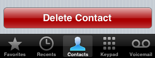
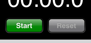
 One of the most striking elements of “modern” user interfaces is that half the buttons are so shiny that it’s a wonder magpies don’t break into your house and make off with your PC. This is all very pretty, but it can be a bit of a nuisance for the developer.
In particular, the iPhone’s built-in apps (e.g. Clock, Contacts) have some very nice, glossy, colored buttons that any developer would want to emulate. Unfortunately, there is no built-in API that allows a developer to conjure up similar buttons; you have to roll your own. To address this problem I’m going to spend the next several days walking through the process of creating the shiniest, happiest buttons imaginable. I hope you find it helpful.
Overview
There are six basic questions that must be addressed when creating glossy buttons:
- How to render a glossy image
- How to render a button’s label
- How to render a button’s background
- How to clip a button’s body and background to a rounded rectangle
- Where to store the code for this project
- When to execute the code
In passing, it should be noted that the iPhone SDK does offer the unsupported UIGlassButton class; this does 95% of what we want, and, if officially supported, would probably obviate the need for these posts. Since it’s unsupported, however, and since (reportedly) Apple will NAK your app if you use it, let’s ignore it for now.
How to render a glossy image
If you google around, you find that it’s pretty simple to create the illusion of a glossy appearance: draw a gradient which darkens towards the top of the button, and then draw an alpha-blended white highlight over the top half of the button, in which the alpha intensifies towards the top of the button. That’s a very vague description, of course, but it will produce “sort of” the right appearance.
Developing the particulars of the procedure – what colors to use in the base gradient, how intense the highlight should be, and so forth – is a lot of work. Fortunately, this guy has done it, and he’s come up with some very nice code that works out gradients and highlight intensities for any base color. We’ll use his code as the basis for rendering a glossy button.
How to render a button’s label
After you render your shiny happy button, you’ll want to put a label on it. The base button code won’t necessarily help you, but you can use some NSString UIKit Additions to render and center the text.
How to render a button’s background

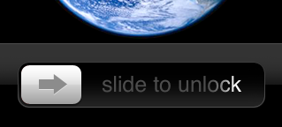
 Glossy buttons don’t look quite right if they end abruptly; they really need at least a one pixel border. Some glossy buttons settle for this, but if you look at the Clock app, you’ll see that the buttons are in fact surrounded by a recessed “well” background. (This effect can be seen more dramatically in the “slide to unlock” control.)
This well will also have to been created manually, and set as the background image for a button. It looks to be a simpler effect than the glossy highlight, but we’ll have to see how it goes.
How to clip a button’s body and background to a rounded rectangle
Somewhat surprisingly, given that nearly everything in its UI is rounded off, the iPhone doesn’t offer a particularly convenient way to clip images to rounded rectangles. It can be done pretty simply with Core Graphics, however, which we’ll use to finish off our glossy buttons.
Where to store the code for this project
Somewhat wierdly, UIButtons can’t be subclassed. More precisely, they can be subclassed, but the subclasses can’t really be created; UIButtons have a read-only buttonType property, which can only be set by the buttonWithType factory method of the UIButton class.
So, if we don’t want to get into undocumented methods, we’ll have to store our code in a UIButton category. I believe all necessary code will fit into either class or instance methods of such a category.
When to execute the code
Once we work out how to create the desired appearance of a button, the question arises as to when that code should be executed; should it be part of a class’ drawRect method? Or should it be used to create an image, with the result passed to a button’s imageForState method?
Given the subclassing issues discussed above, and for reasons of performance, I’m choosing to use the rendering techniques we will see to create static images, which are then displayed by ordinary UIButtons. I think this will be the fastest, easiest, and most flexible course.
Upcoming:
Here’s how I plan to cover the glossy button issue:
- Tomorrow: Rounded Rectangles
- Monday: Glossy Images
- Tuesday: Labels
- Next Friday: Wells
See you tomorrow!
P.S.
If you’d like to do a remix of “Little Fluffy Clouds” on the theme of glossy widgets, I’d heartily endorse the project.
The most beautiful [buttons] as a matter of fact
The [widgets] were purple and red
And yellow and on fire
And the [sliders] would catch the colors everywhere


Pingback: The Flying Jalapeno Lives » Open Source iPhone – Glossy Buttons
Pingback: objective-d » Blog Archive » Glossy Buttons